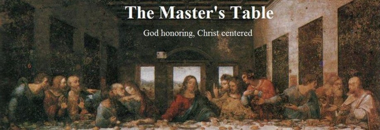
What’s the first thing you notice when you look at da Vinci’s Last Supper? It should be Jesus. He is in the middle of the picture, with six apostles sitting on either side. The composition of the painting is designed to draw your attention to Christ, who – here comes a revelation – is at the center.
I’ve just messed with my banner design. I looked for wallpaper, banners, something other than the large blue rectangle I used to have. I’ve played around with the sub-heading several times, and have recently chosen “God honoring, Christ centered.” It’s a good match with the portrait. I changed the color of the text as well, but not sure it’s easy enough to read. Give me some feedback.

One thought I already had was to put “God honoring, Christ centered” as the main headline, and have “Clark Bunch’s Weblog” as the smaller sub-header.
Good idea. You might want to bold the subtext, too, or something. It’s a little tough to read. ‘Course, that could just be my tired eyes.
I can change the wording and the text color, but that’s it. After a person reads it the first time, that’s probably the last time they’ll ever look at it anyway. After your first visit, you know who I am and what site your coming to. The reason one comes back is to read the content.
True dat. Just a matter o’ style, I guess. Keep on truckin’.