
One of the most read bloggers on the internet gave me a good piece of advice back when I first started blogging. He said “Find a theme and a design that works for you and leave it alone.”
I have tried to do that. The Master’s Table has not had a face lift since the doors opened in May of 2008. I’ve been wanting to switch to a 3 column theme for some time for a couple of reasons. One is that the sidebar ran so far down the page on my 2 column theme, and the design was just so narrow. My Other Blog is done in Andreas 9 which I love except for one thing; the headers above each widget are too close to what’s above them, and not close enough to what they are meant to label. It’s a small thing, and I don’t want both blogs to look alike anyway. BTW, find some other blogs in Digg 3 and then ask me how I got the title to look like that.
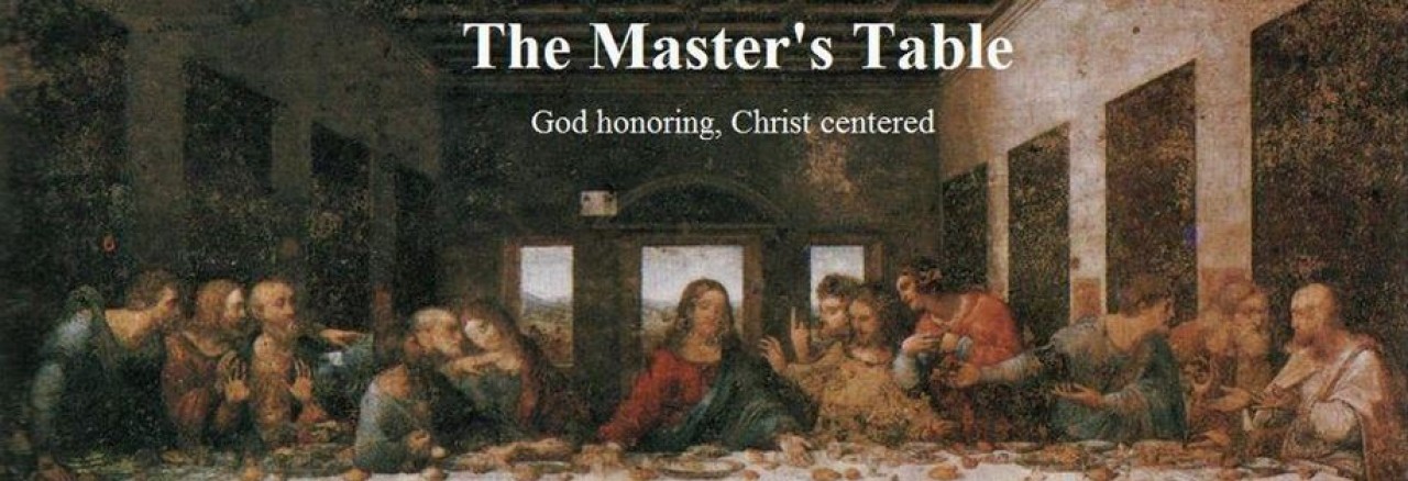
So, to make a short story long, this is the new look of The Master’s Table. What do you think?
p.s. If you’re in a reader, jump over to the actual site for a minute. Thanks a bunch.

Looks nice, but because I’ve been using a feed reader I can’t remember what it looked like before.
It looked very similar, but in a 2 column format. I switch to 3 columns, and kept the design as close to the original as possible.
And hey, a feed reader means you’re a subscriber, so I’m all good with that!
I’ve always liked this theme; it’s clean and usable, while also looking really nice. Your header is good, did you paint it yourself? 🙂
BTW, I subscribe to the New-Theme-Every-Week school.
I “painted” the blog title and by line onto the jpeg file, then imported it as a custom header image. That was the only way to 1) center the title and 2) keep my by line. Digg 3 doesn’t have an option to display it. So yeah Mike, I did kinda’ paint it myself 🙂