
One of the most read bloggers on the internet gave me a good piece of advice back when I first started blogging. He said “Find a theme and a design that works for you and leave it alone.”
I have tried to do that. The Master’s Table has not had a face lift since the doors opened in May of 2008. I’ve been wanting to switch to a 3 column theme for some time for a couple of reasons. One is that the sidebar ran so far down the page on my 2 column theme, and the design was just so narrow. My Other Blog is done in Andreas 9 which I love except for one thing; the headers above each widget are too close to what’s above them, and not close enough to what they are meant to label. It’s a small thing, and I don’t want both blogs to look alike anyway. BTW, find some other blogs in Digg 3 and then ask me how I got the title to look like that.
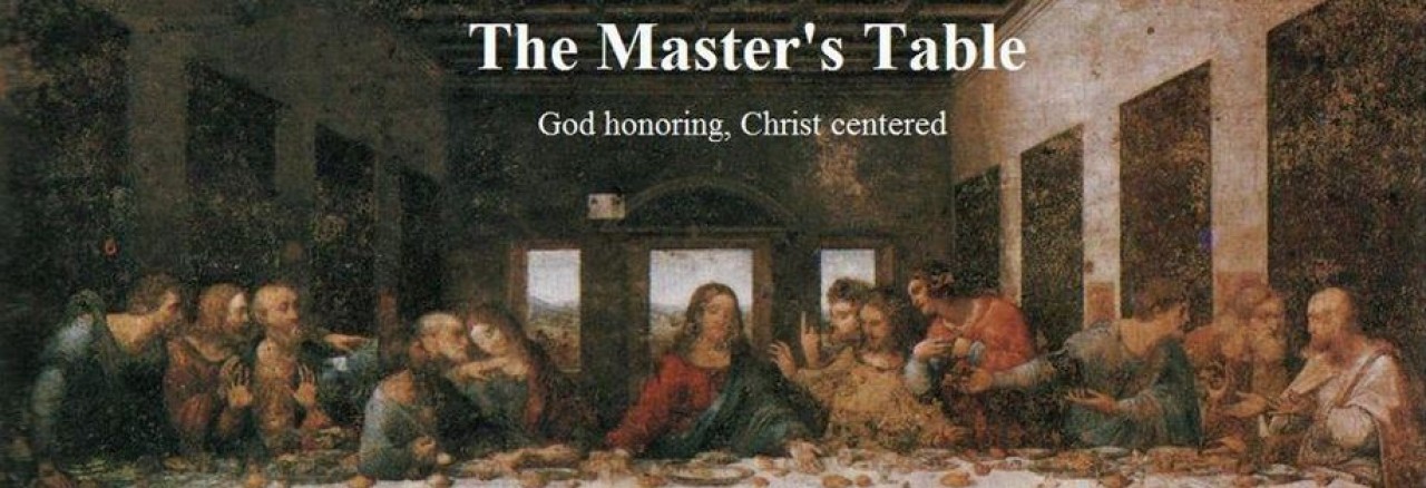
So, to make a short story long, this is the new look of The Master’s Table. What do you think?
p.s. If you’re in a reader, jump over to the actual site for a minute. Thanks a bunch.


 I just kept seeing blogs that had a Cluster Map. My curiosity was tweeked. I know how many people each day read my blog, but where are they? I added my own map on Jan. 11th, at the bottom of the right-hand sidebar. You can click the map (at the bottom) for a detailed list of how many viewers are from each country.
 It’s that time again. Time to add some new friends to the blogroll. New on the blogroll at this time is

